Overview
As the in-house Marketing Creative Services Specialist, I was asked to develop an initial logo direction for Nut Hill during the early stages of planning. The goal was to establish a visual identity foundation that could potentially support future branding and marketing development if the project moved forward.
(Concept exploration only; the project did not proceed beyond logo finalization.)
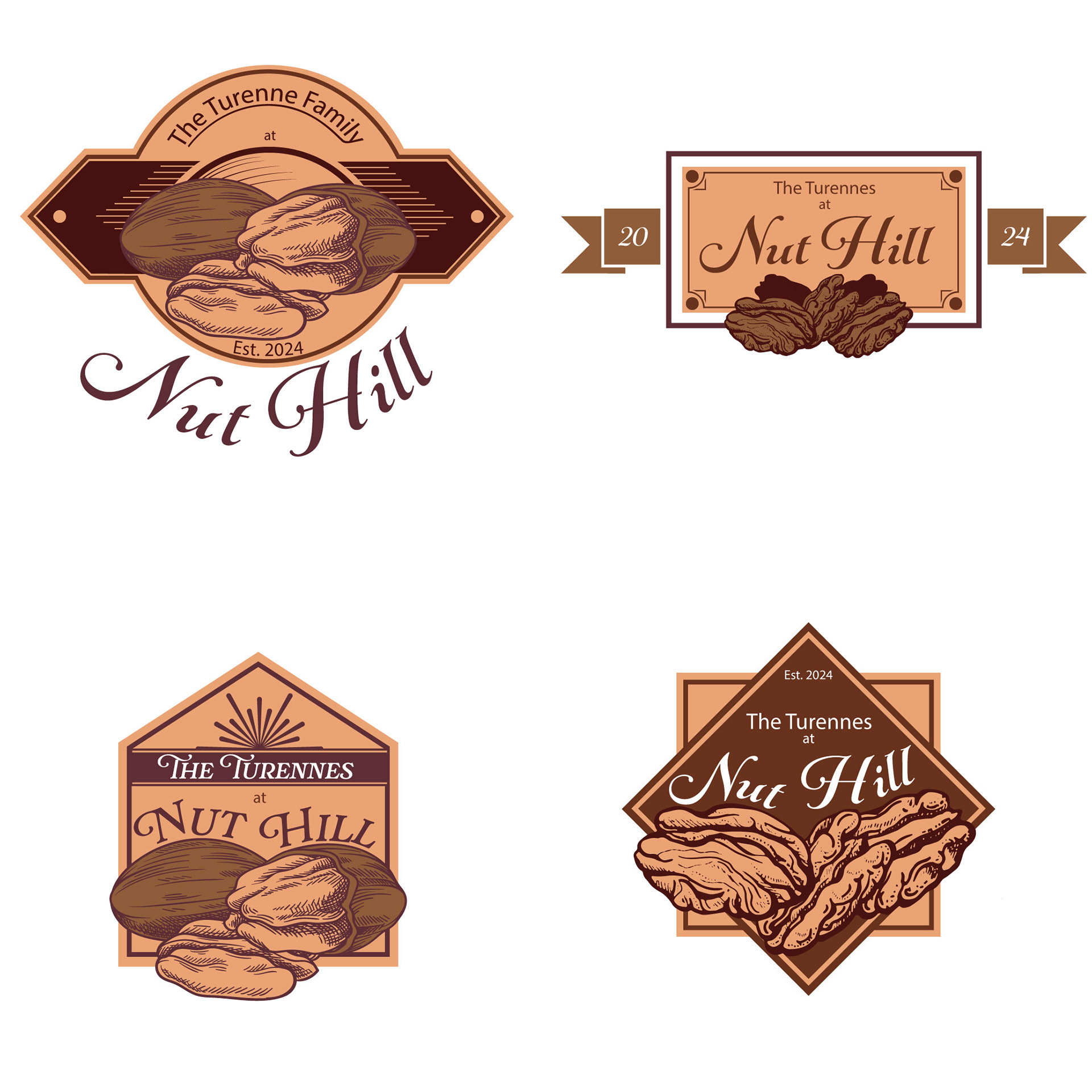
First round of concepts in development
Logo Development
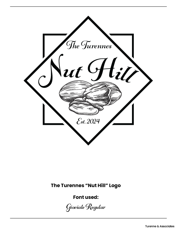
The logo was designed to reflect the requested old Southern, classical aesthetic with agricultural tones and simplified forms. The nut imagery was sourced from a stock image and adapted as part of the logo foundation, while the remaining elements were created in Illustrator to develop the vintage-inspired visual direction.
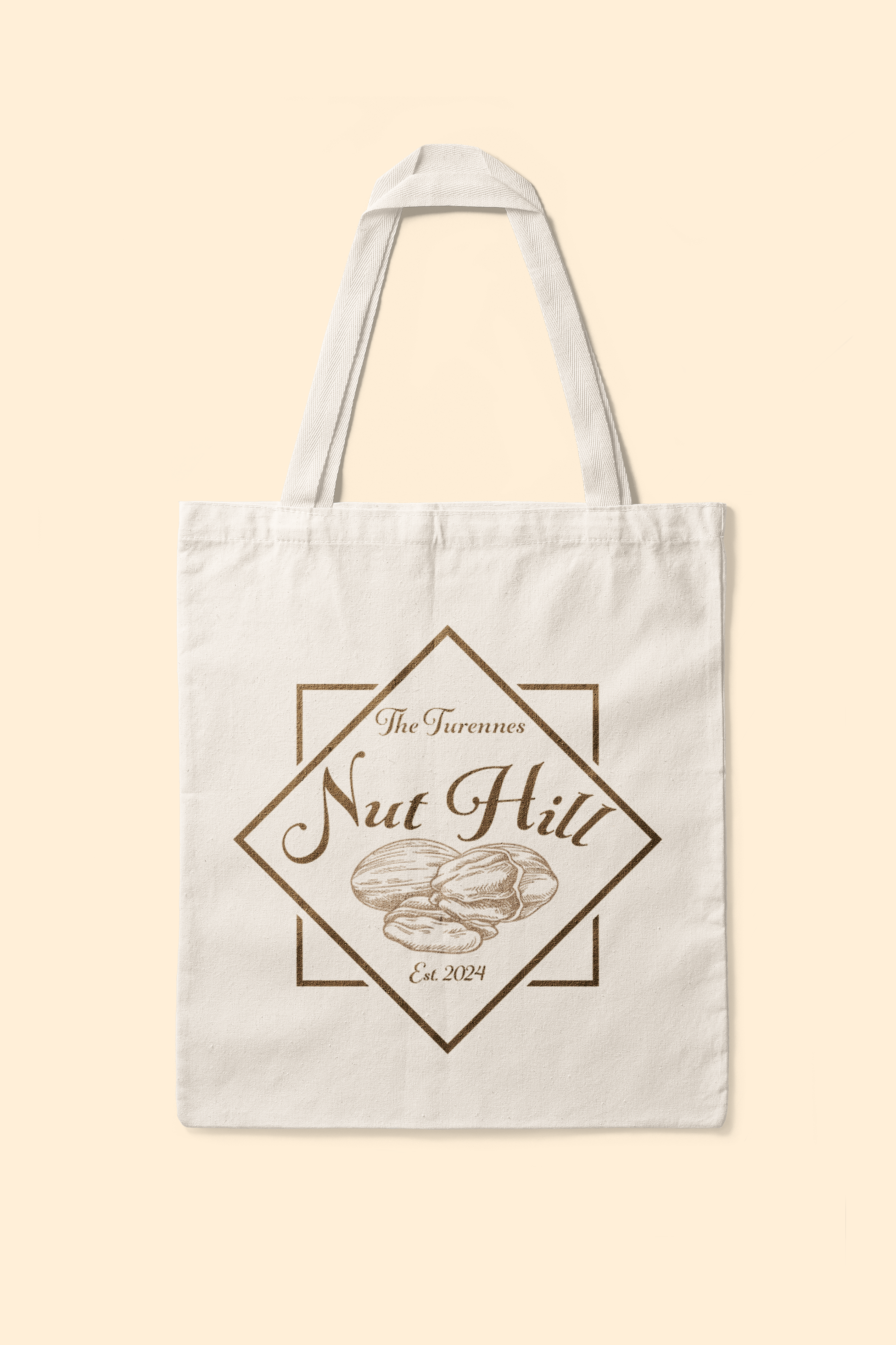
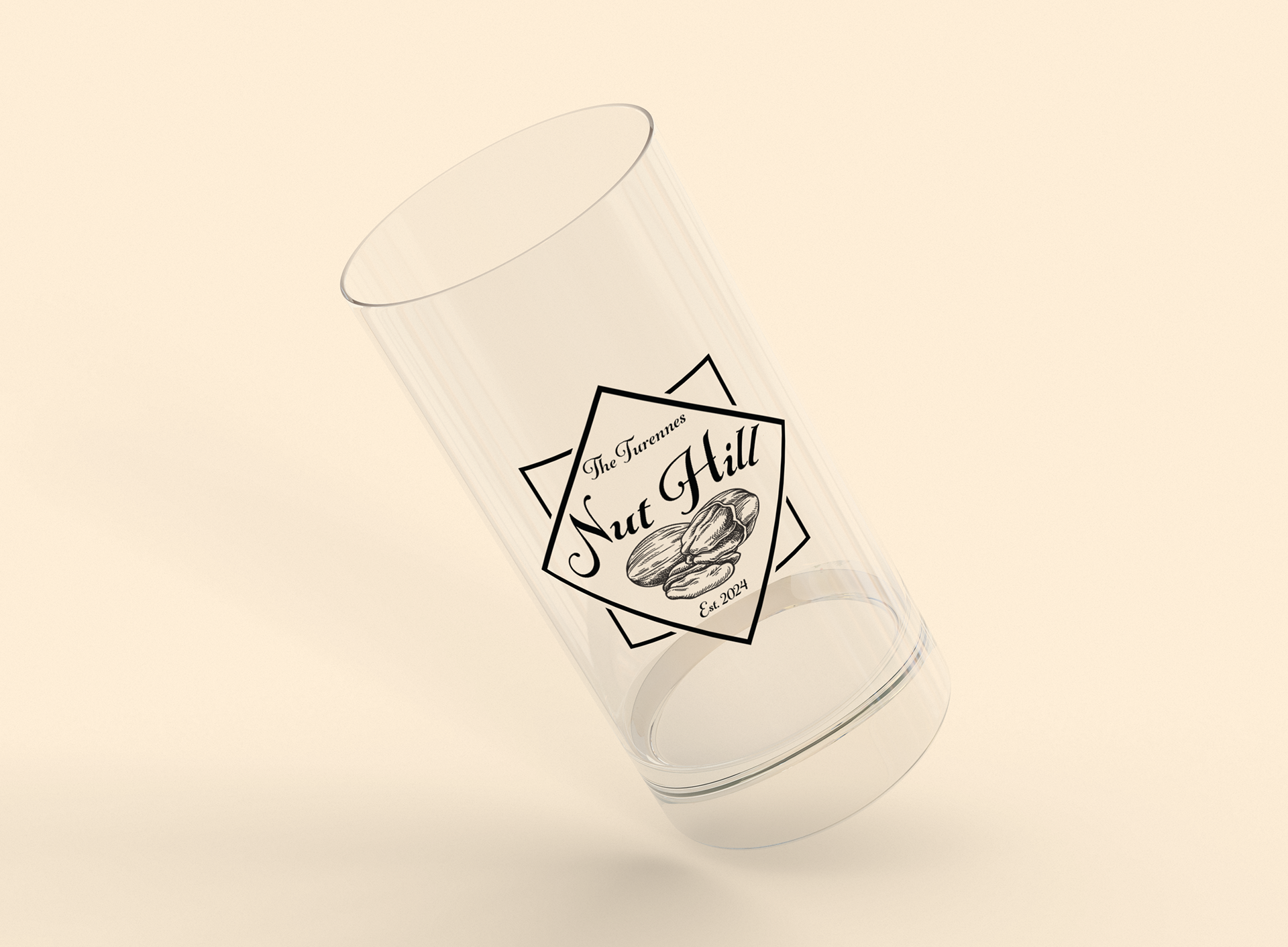
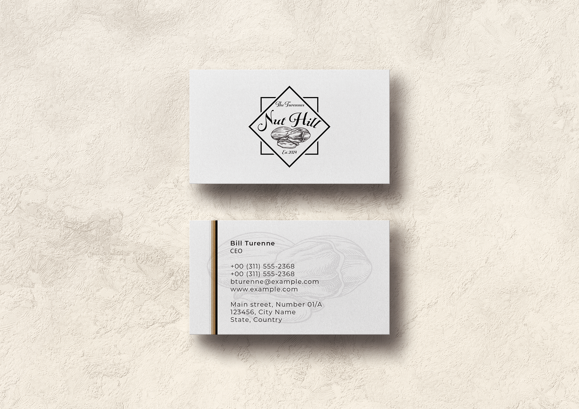
Logo on miscellaneous items for mock-up